Se Son Rose
Branding / Packaging
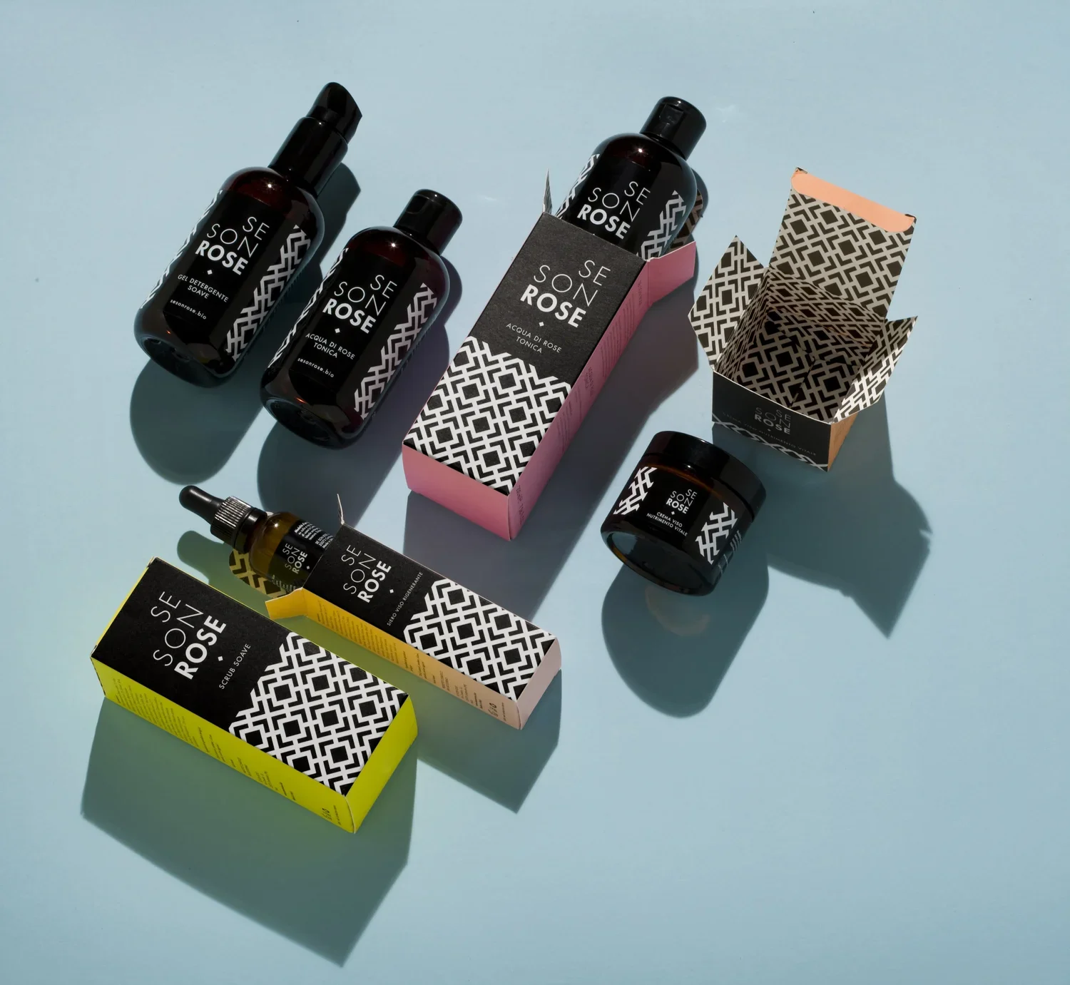
Naming, Branding, Logo and Packaging Design of the beauty line Se Son Rose
About this project
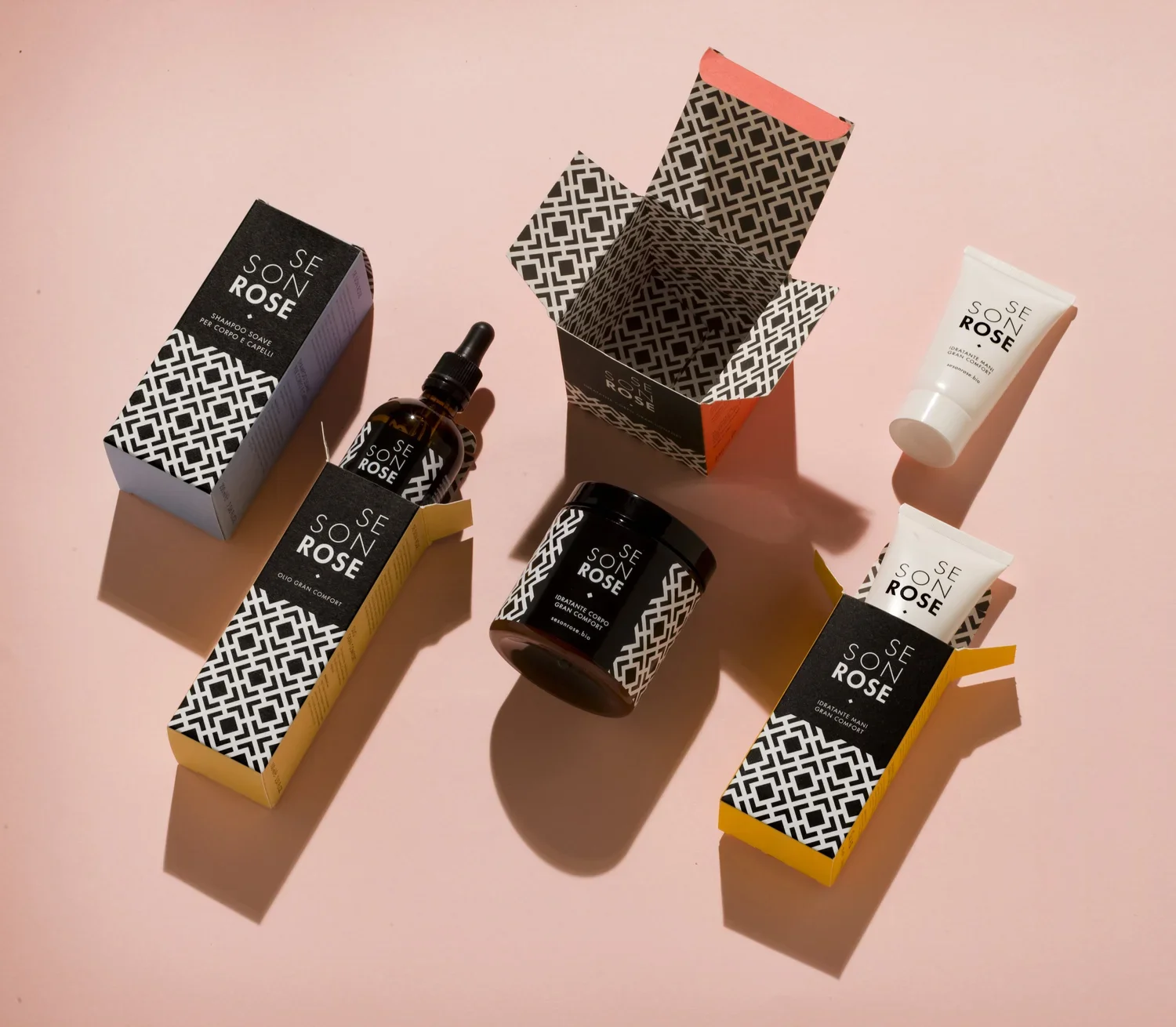
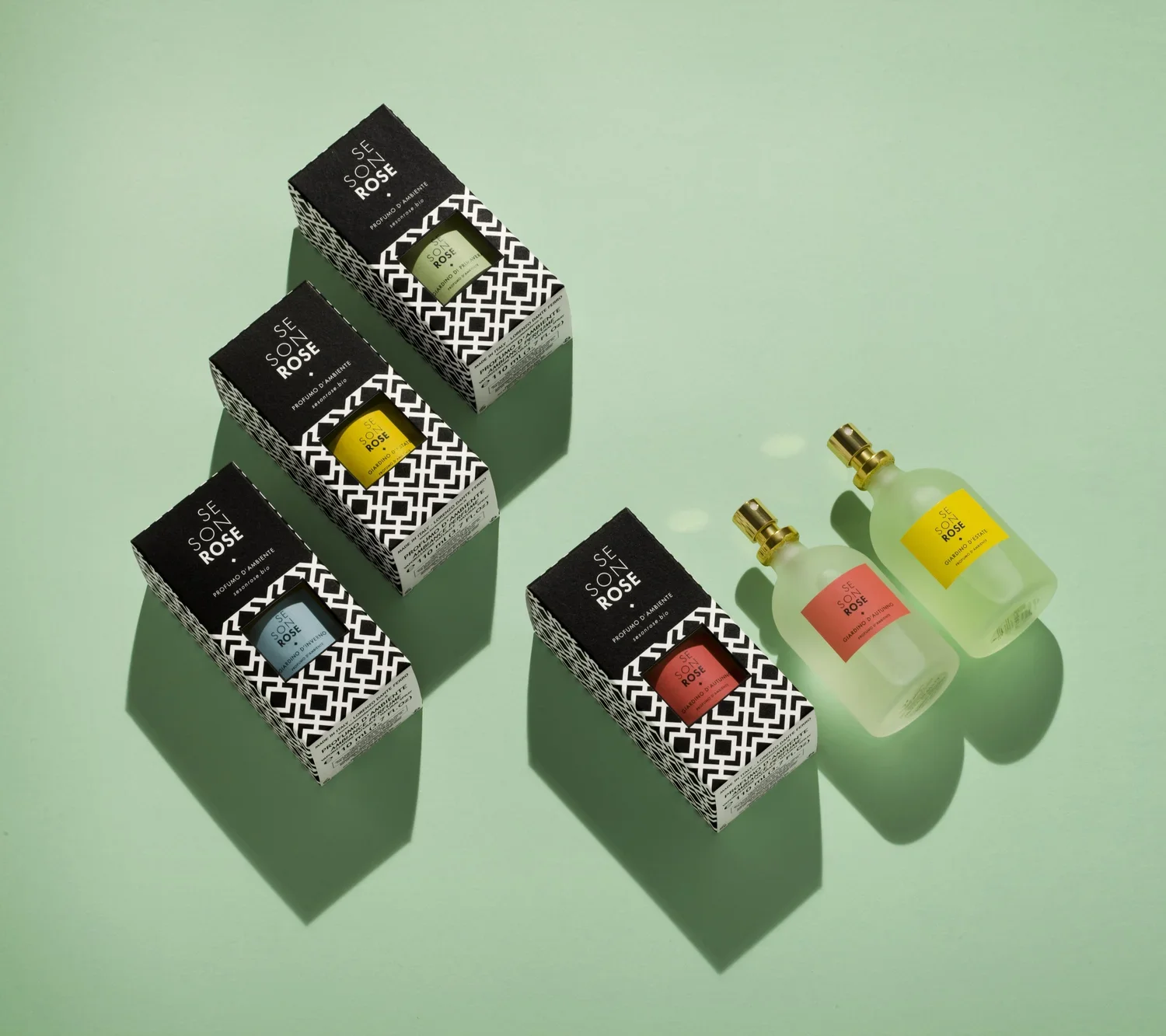
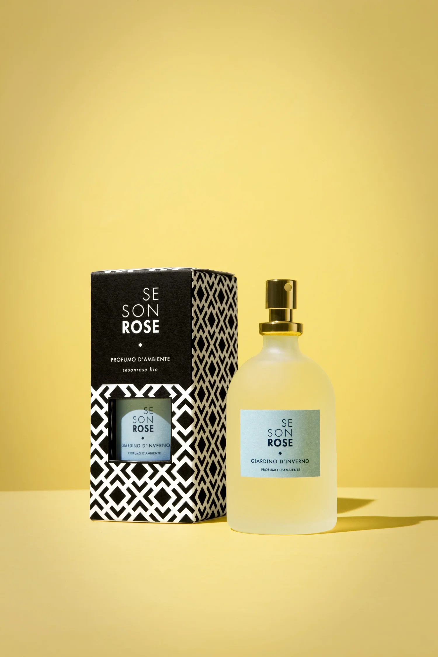
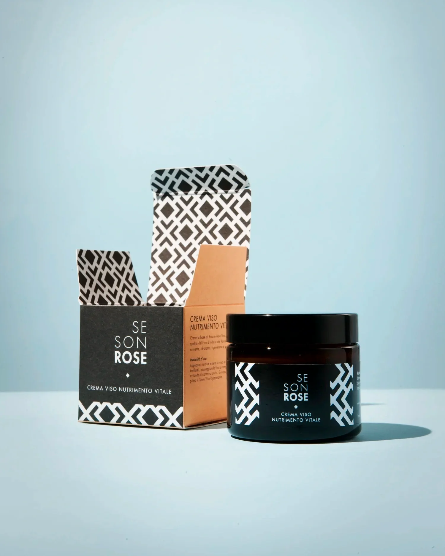
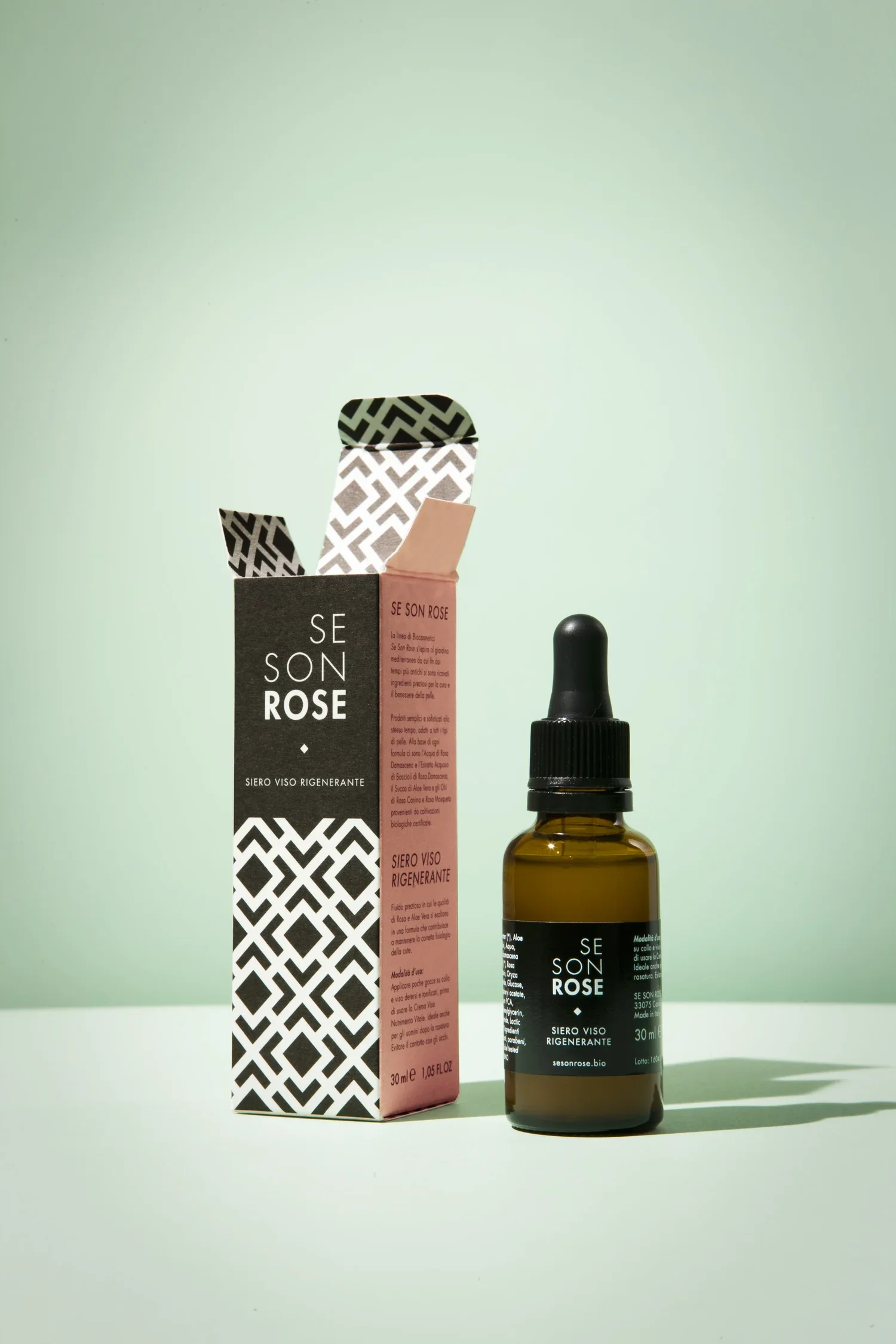
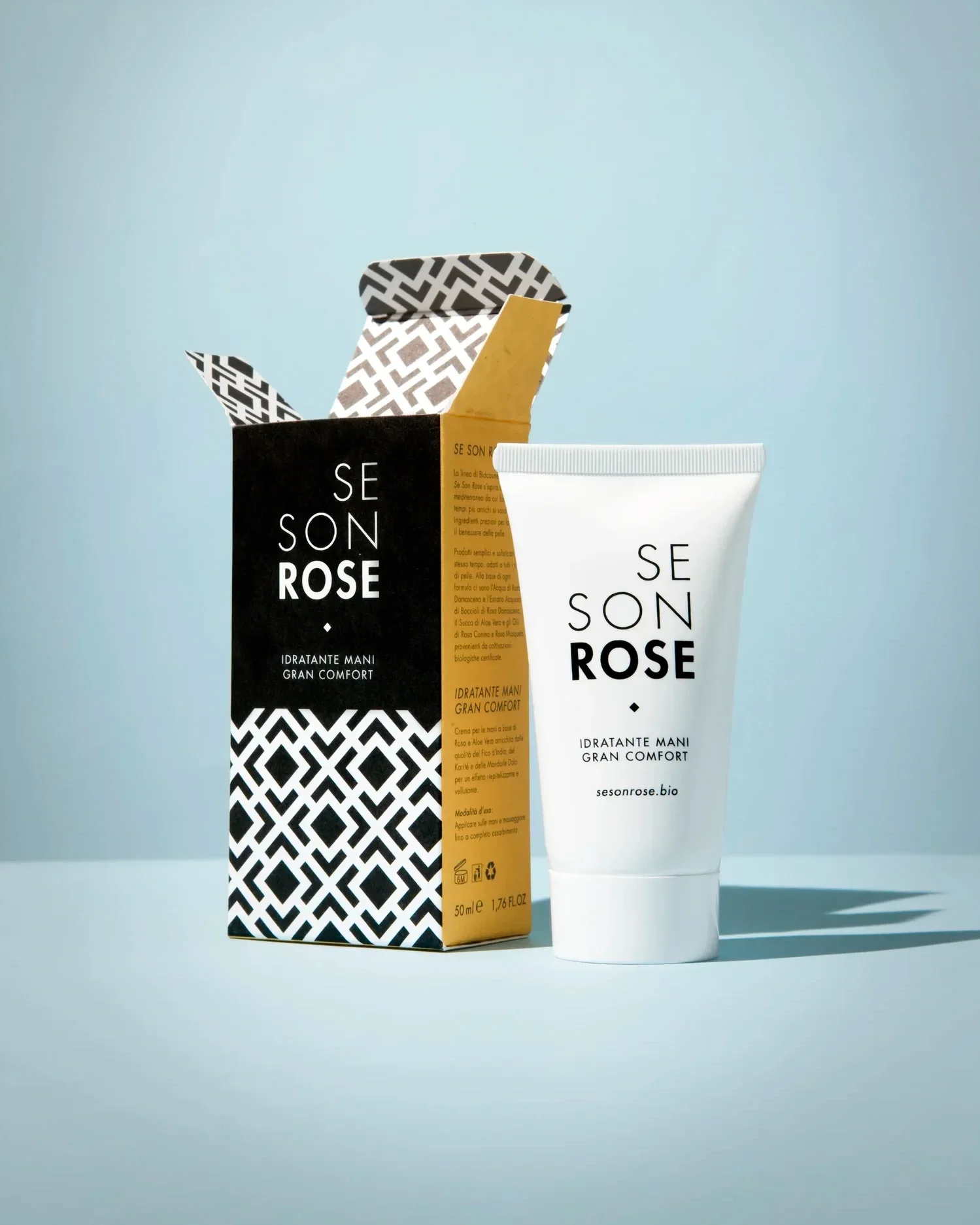
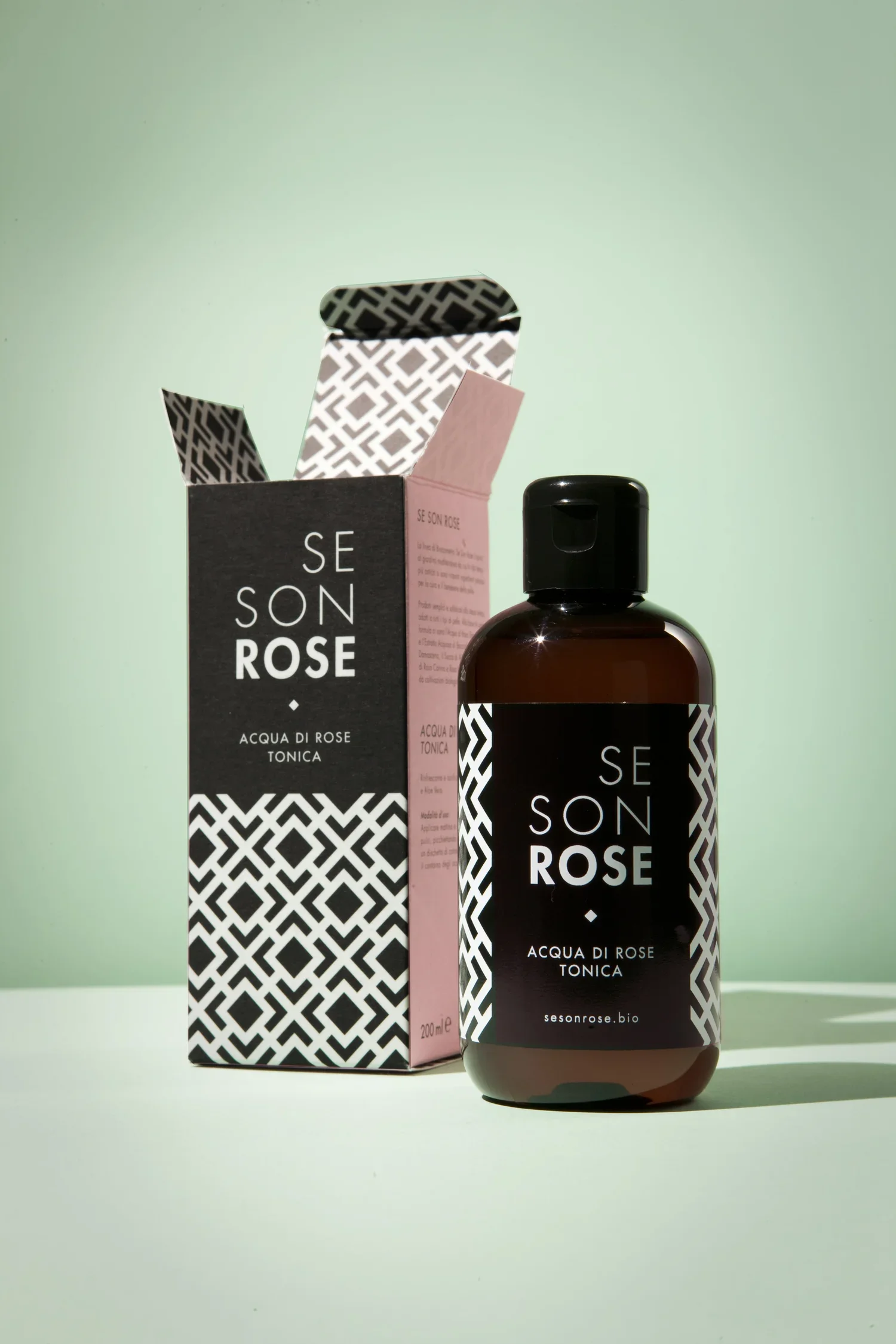
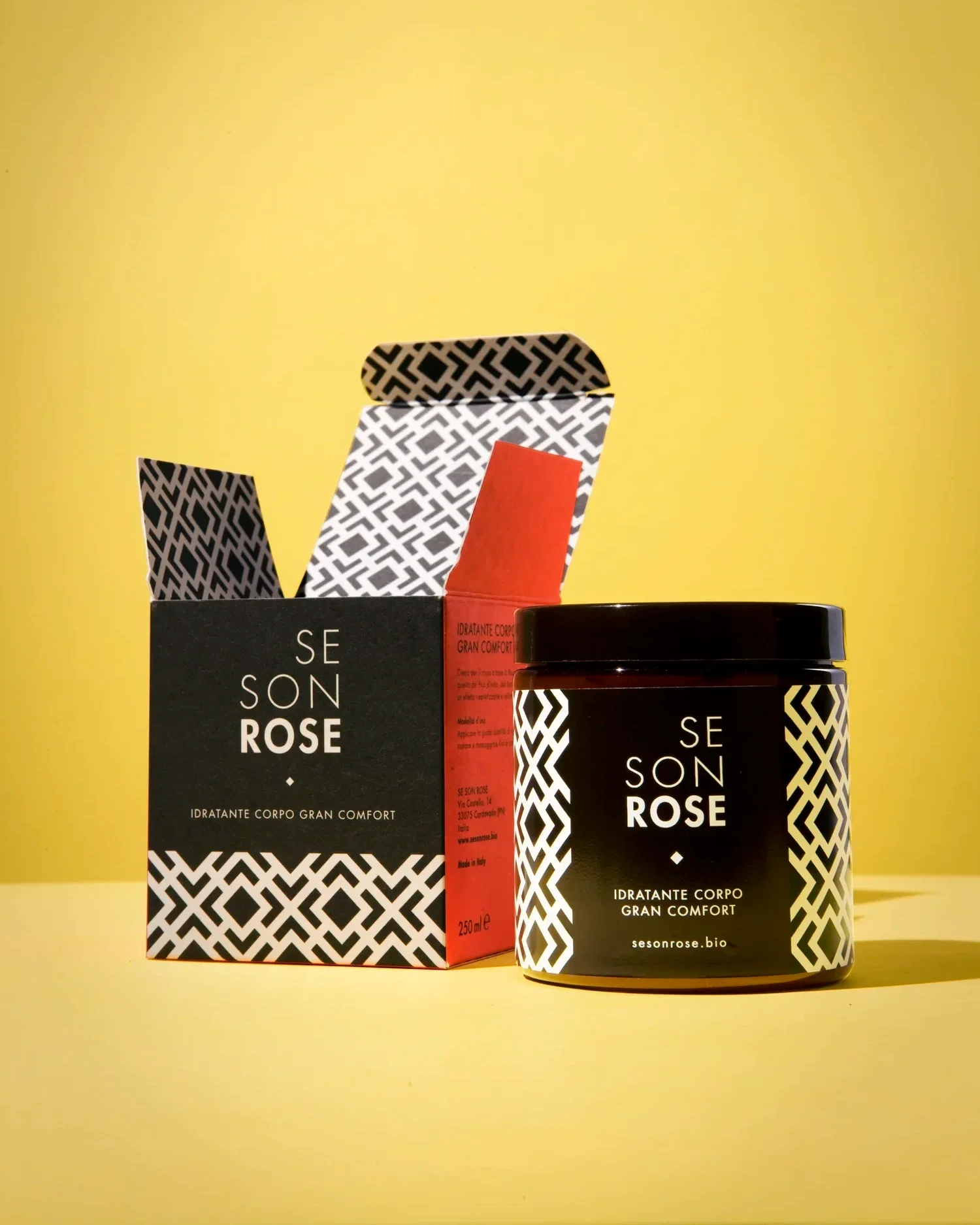
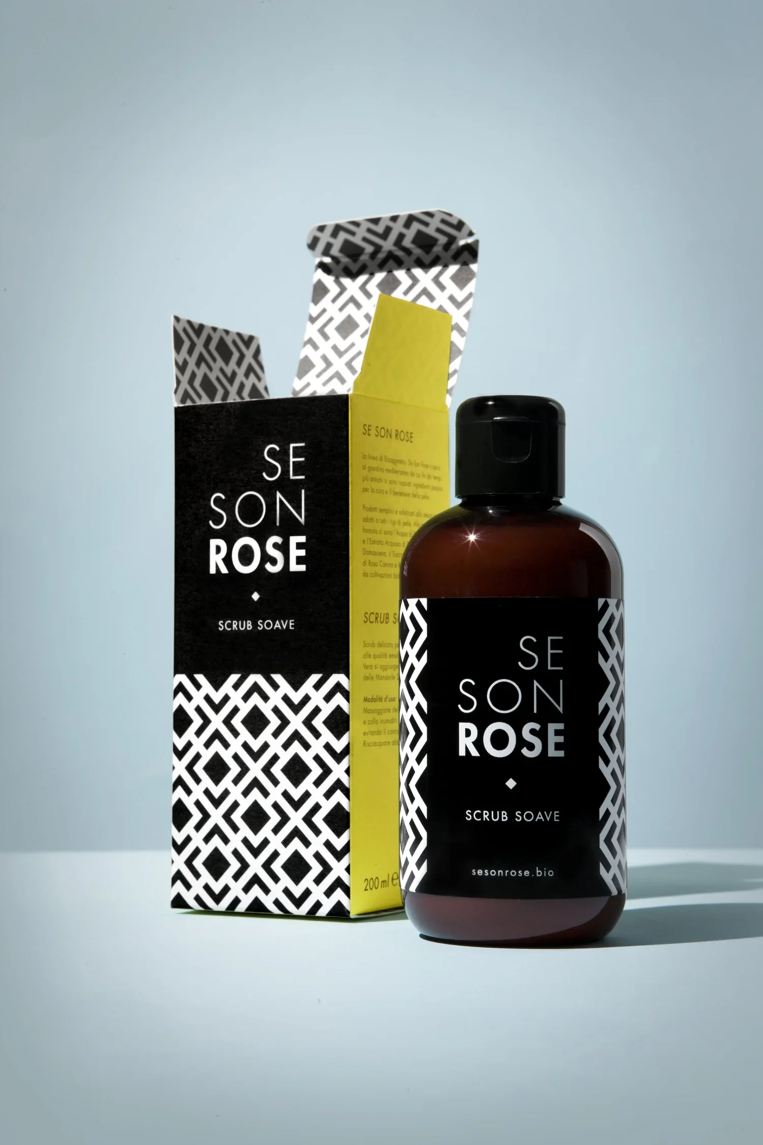
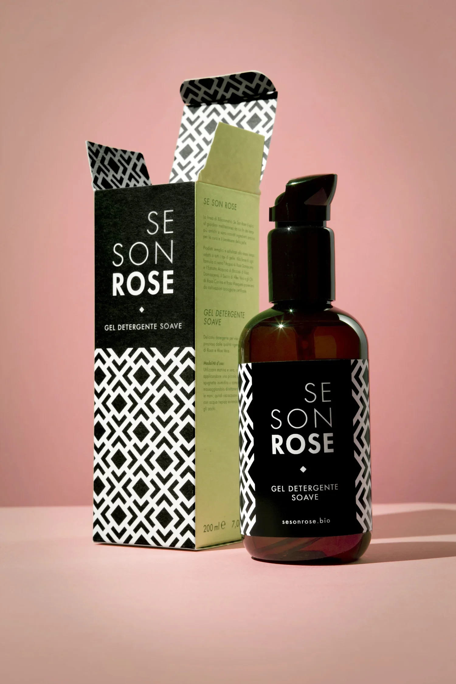
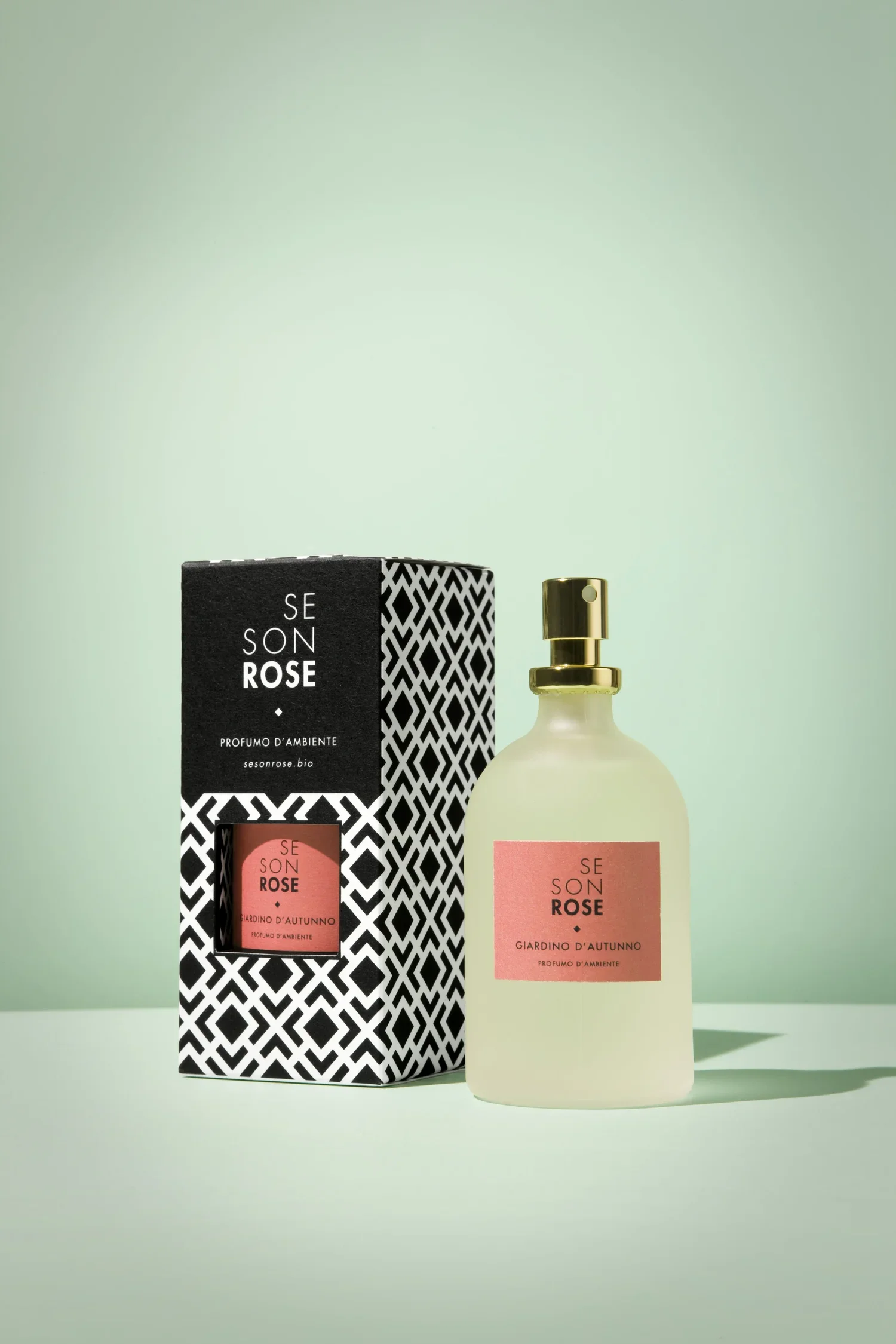
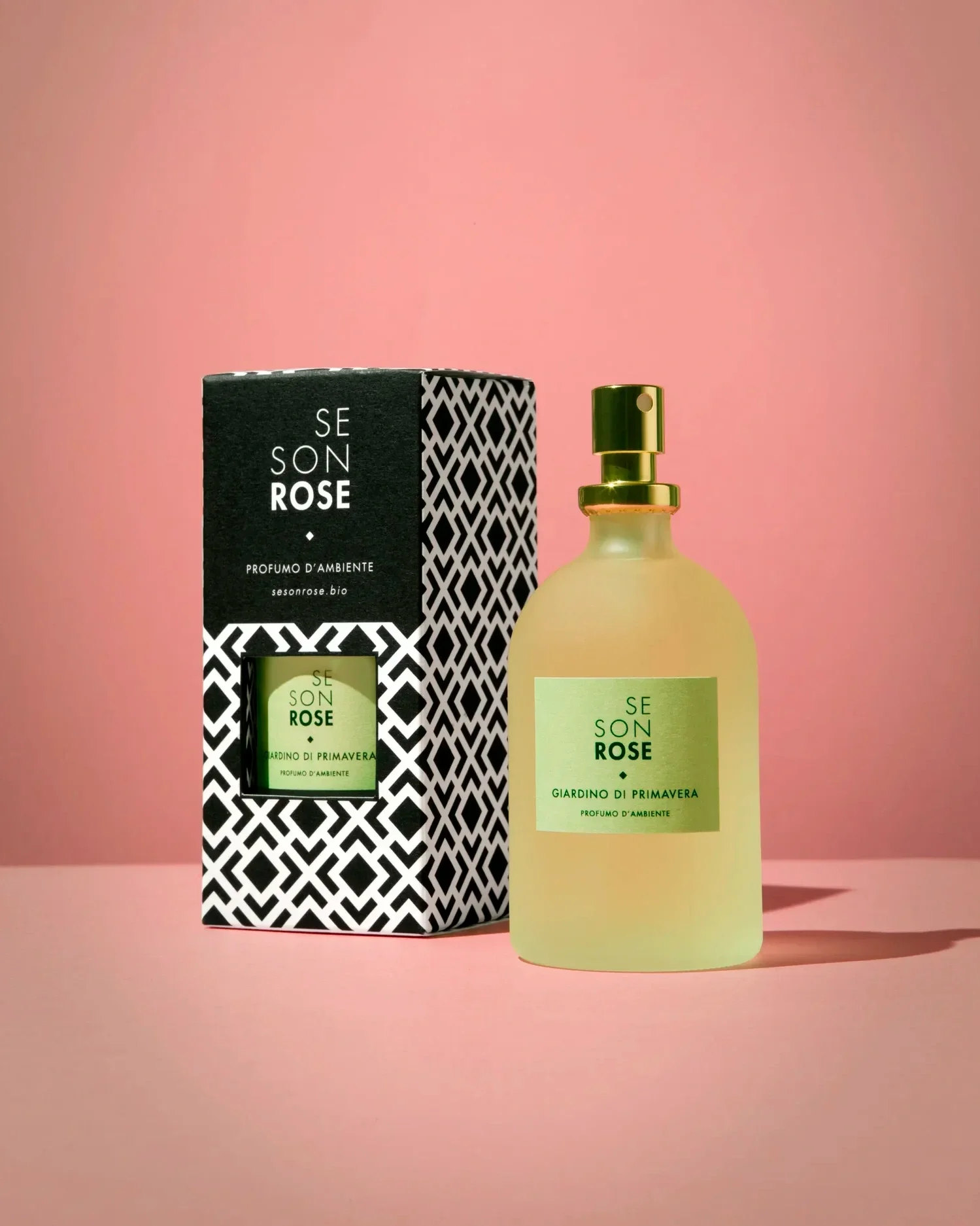
The visual identity has been carefully crafted to speak to both women and men, reflecting the unisex essence of the collection. The playful outer packaging reveals minimal, timeless bottles and jars conceived to be displayed as elegant objects within any bathroom setting.
The geometric motif draws its essence from a labyrinth of roses, translating a poetic inspiration into a contemporary visual language. It embodies the harmonious dialogue between natural beauty and deliberate design — a signature both modern and enduring.